Published September 2025 as part of the proceedings of the first Alpaca conference on Algorithmic Patterns in the Creative Arts, according to the Creative Commons Attribution license. Copyright remains with the authors.
doi:10.5281/zenodo.17084378
I’m an undergraduate physicist working with magnetic resonance imaging (MRI) at the University of Nottingham. In my research I look at the ways imaging at ultra-high fields (7T+), itself primarily for further research, can be improved, focusing on techniques to reduce magnetic field inhomogeneity, so that images are accurate depictions of anatomy, or have good signal to noise ratios.
MRI is a technique founded on radar experiments that took place in the early half of the 20th century, when ex-military physicists found themselves with a glut of radar equipment on their hands, and pointed it into solid matter rather than aeroplanes. Improvements in digital computation (another product of the Second World War) enabled image reconstruction beyond the simplest cases, and MRI scanning became possible.
I like to remember that the actual nuclear magnetic resonance experiment that underlies every scan is analogue in nature, and grounded in algorithm patterns. MRI is a beautiful and vastly underappreciated physics experiment, and one that impacts all of our lives. The artistic application of medical imaging has been explored1 2 3, and there is some prior work looking at MRI as a method of artistic image making 4 5.
In this work, I focus on the physics beneath MRI images and explore approaches to thinking about and talking about MRI starting from algorithmic patterns and seeing where these take us.
Every MRI experiment is concerned with a phenomenon called “echoes”. These are sudden increases in signal (an oscillating current your body induces in a coil placed around it whilst in the MRI scanner), as an incoherent signal is tricked into becoming coherent again – either because we yank it around with magnetic field gradients, or by pointing everything back the way it came and letting it rewind the loss. Along the way, we use additional magnetic fields to encode anatomical information and influence which magnetic properties of tissue contribute to the image.
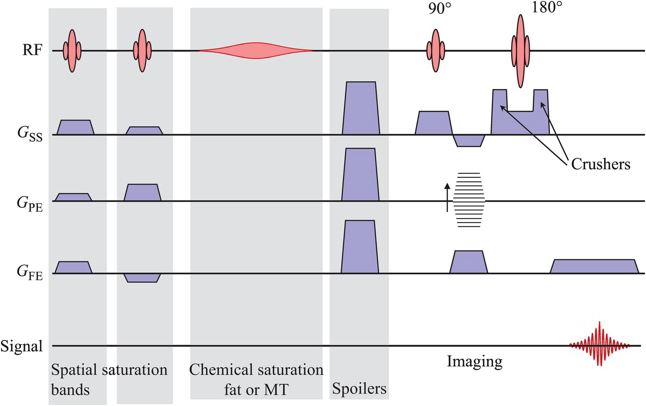
The instructions of which magnetic fields to use and when exist in the MRI scanner as code, but are usually communicated within the community as pulse sequence diagrams, like this:
McRobbie, Donald W. MRI from Picture to Proton. 3rd ed. West Nyack: Cambridge University Press, 2017.↩︎
In this diagram, time goes from left to right. Some preparation pulses (greyed) for various methods are followed by a pulse sequence which excites (the red shape labelled 90 degrees), spatially encodes using gradient fields (the blue and striped trapezoids on the second, third and fourth lines from the top) and refocuses (the red shape labelled 180 degrees) a signal. Each of these is the application of a magnetic field whose timing must be precisely controlled (like turning an mp3 into speaker cone vibrations). This pulse sequence results in a single spin echo, shown as the red wriggly line on the last line.
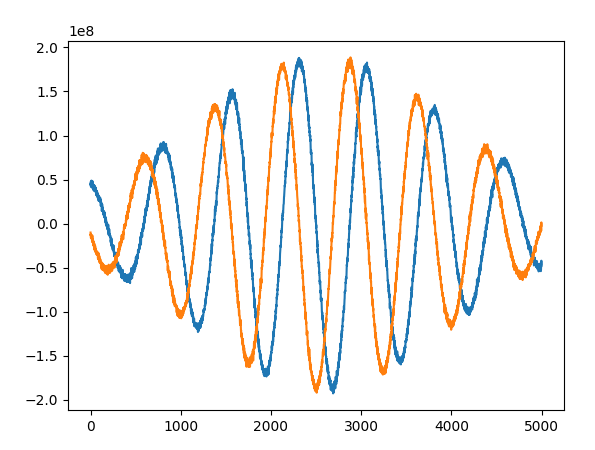
We can do a similar experiment to some water in a test tube. The spectrometer cannot hear the radio frequency (GHz) signal a sample produces, so we instead measure its offset to a fixed reference signal. It just so happens that this offset is usually in the audio frequency range, so we can listen to the spin echo as the spectrometer will receive it6
Since each echo is a bit of useful information, we’d like to get as many of them as quickly as possible (subjects get fidgety!) but there are safety limits to how many pulses we can use in a time interval (they put heat into the subject), the rate at which we can drive gradients (they can induce currents in the body7) and there are intrinsic timing requirements in order to get certain sorts of images.
MRI pulse sequences are designed using a number of tools, but one of the most useful for understanding what it is a pulse sequence is doing, when these echoes will occur and what sort of information they will contain is called phase graph analysis (extended phase graph analysis, nowadays). This is a simple three step algorithm, but is quite tricky to write down:
In these diagrams, an echo occurs whenever a line crosses the central (0-phase) line from the right8 Echo timings are to scale along the time axis, and multiple echoes coinciding give a stronger signal.
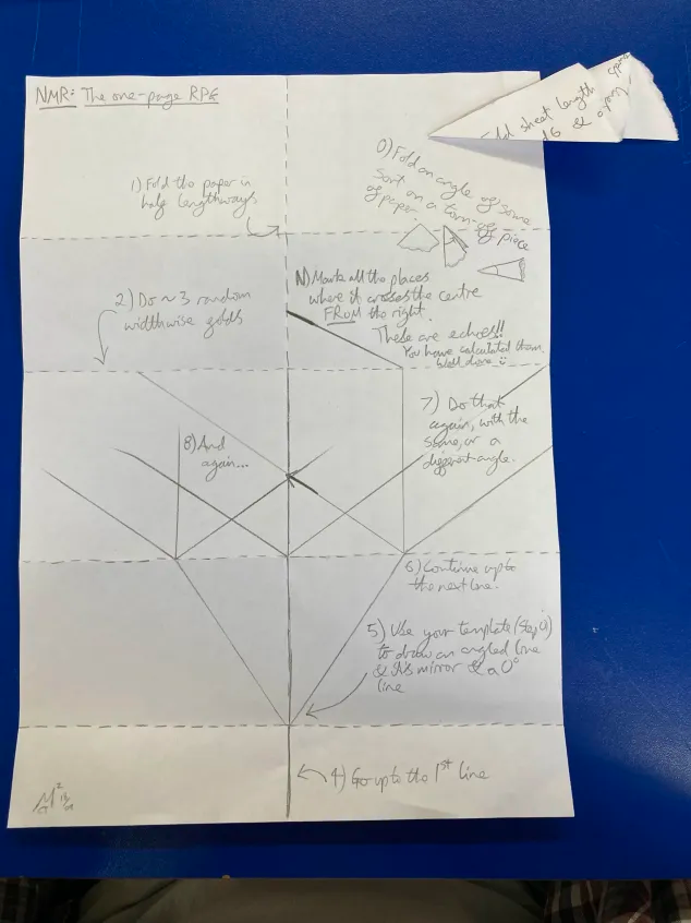
These steps can be further simplified by taking them out of the context of MRI and using them as instructions for plotting a trifurcating tree. I have done this, and used the resulting pattern-making activity as a workshop to enjoy for its own sake, and use as a way to start talking about MRI. To do this, I wrote them into a “1-page RPG zine” style document and suggested participants use a paper template to help mark the angles.
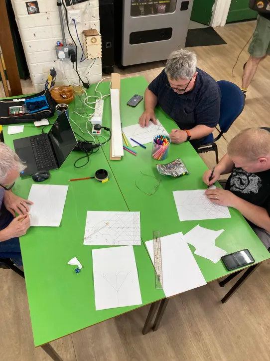
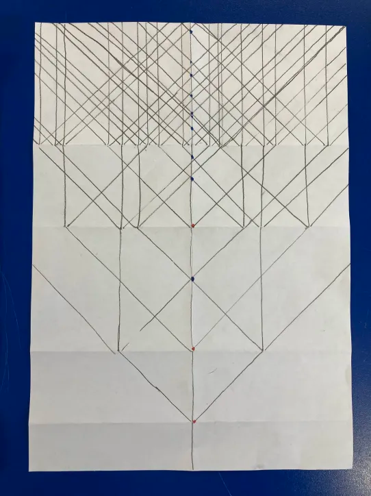
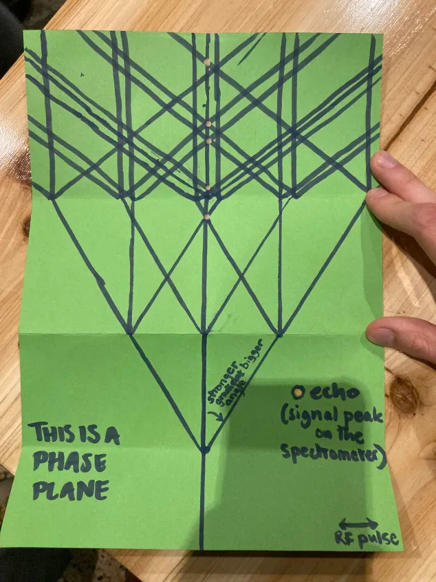
My subjective impression, and the number of successfully completed graphs, is that people enjoyed this pattern-making activity. During the making of their phase graphs, participants would ask questions about the process that naturally came up, like “what happens if it goes off the page?”, “can I change the angle? What about between pulses?” and “what does it mean if multiple cross at the same time?”. These are all really good questions about pulse sequence design, and raise interesting problems or suggestions of techniques we could use. I found it challenging to answer these questions without explaining MRI more detail than we had time for, but I was usually able to by referring back to the phase graph and how the line they were asking about might contribute to a future echo.
At a Sheffield pattern club meetup, I was lucky enough to follow a talk about bobbin lace making. They explained how an error at some point in the lace has a history that is traced through the threads back to some mistake, sometimes a long way previous, but always traced along the thread. This is extremely similar to how the signal intensity of some echo depends on the history of the line that arrives at that echo, where it comes from, and what sort of gradients in traveled through and was an unexpected point in common.
The biggest challenge to this approach is that hand-plotted phase graphs don’t straightforwardly relate to the image you see. In the extended formalism, each line has a strength or opacity and it’s possible to get some sense of how different tissues might result in different strengths of echo. The phase graph also only applies to signal within a single voxel. It isn’t possible to relate it to how the entire image is acquired, and MRI image acquisition “spatial encoding” is hard to explain. I have begun developing tools (available on my website), which allow you to interact with MRI in a more conventional framing, but they are much more complex to understand and use, and not yet well integrated with the phase graphing approach.
Presenting phase graphing analysis starting from such a simple algorithm resulted in patterns that were appreciated in their own aesthetic sense, and also enabled participants, all nonspecialists, physicists, to explore the core of MRI, and ask really insightful questions about pulse sequence design and gain some understanding about a technique which will underlies so much of our healthcare.
‘Science Art Network’. Accessed 31 May 2025. https://scienceartnetwork.org/.↩︎
‘Artwork Inspired by MRI Brain Scans Installed at Stanford Imaging Center – Stanford Arts’. Accessed 31 May 2025. https://arts.stanford.edu/artwork-inspired-by-mri-brain-scans-installed-at-stanford-imaging-center/.↩︎
Marinković, Slobodan, Tatjana Stošić-Opinćal, and Oliver Tomić. ‘Radiology and Fine Art’. American Journal of Roentgenology 199, no. 1 (July 2012): W24–26. https://doi.org/10.2214/AJR.11.7934.↩︎
Casini, Silvia. ‘Magnetic Resonance Imaging (MRI) as Mirror and Portrait: MRI Configurations between Science and the Arts’. Configurations 19, no. 1 (2011): 73–99.↩︎
Casini, Silvia. ‘Beyond the Neuro-Realism Fallacy. From John R. Mallard’s Hand-Painted MRI Image of a Mouse to BioArt Scenarios - PubMed’. Accessed 31 May 2025. https://pubmed.ncbi.nlm.nih.gov/30358376/.↩︎
here I’ve slowed it down by 100 times so that the recording isn’t over in 0.01 seconds, I promise the original recording is audible!↩︎
If you, like me, sometimes get (completely safe!) involuntary muscle twitches in MRI scans, that’s what’s going on. The term of art is “peripheral nervous stimulation” (PNS) and sometimes the radiographer has the option to scan slower to possible reduce the amount this happens, so you can let them know.↩︎
We could, and in practice do, simplify the plotting of these by only drawing the leftwards traveling line, but this makes tracking lines after RF pulses more challenging. It’s easier simply to instruct participants to split every line into 3.↩︎